A Snappier, New Look Editor
We've evolved the design of the editor to get to you to your code faster. While loading and forking take a fraction of the time.

When chatting with folks in the CodeSandbox community, there’s one word that comes up more than any other: Speed! It’s a core reason why people choose CodeSandbox for web development—so they can get started prototyping quickly, testing out ideas, and learning new frameworks and techniques. But it’s also one of the most frequently requested improvements too.
When it comes to web development, it seems we all have an unrelenting need for speed. But in software, speed is a nuanced thing. There’s how quick things are, and how fast they feel, which is why we’ve been tackling both as part of our snappier, new look editor.

From click to coding in half the time
Over the last few months, we’ve been working on a range of performance optimization tasks. From tweaking database queries and API calls to re-architecting how we integrate with VS Code. We’ve been incrementally releasing these improvements and making things faster as we go. Still, some notable improvements are that average sandbox load and fork times are 1/10th what they were before, we’ve also made the editor feel more responsive when opening new files, and you can now work with much larger projects.
One clear change you’ll see today is that the loading screen is gone. We now progressively load parts of the editor instead of waiting for everything to be ready upfront. So you can begin editing your project in half the time it took previously.
Designed to get you to the code faster
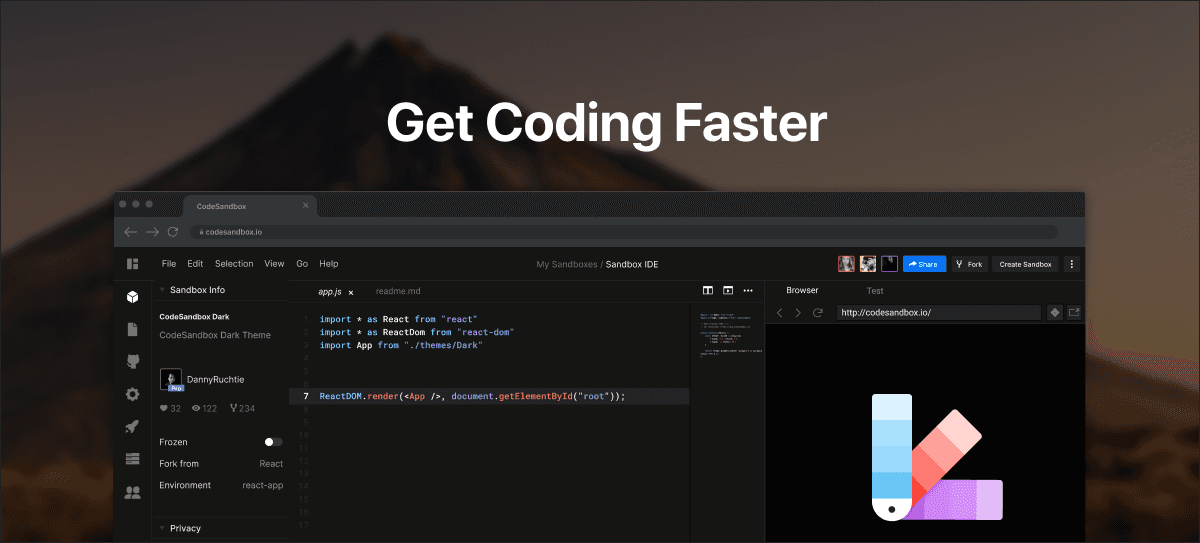
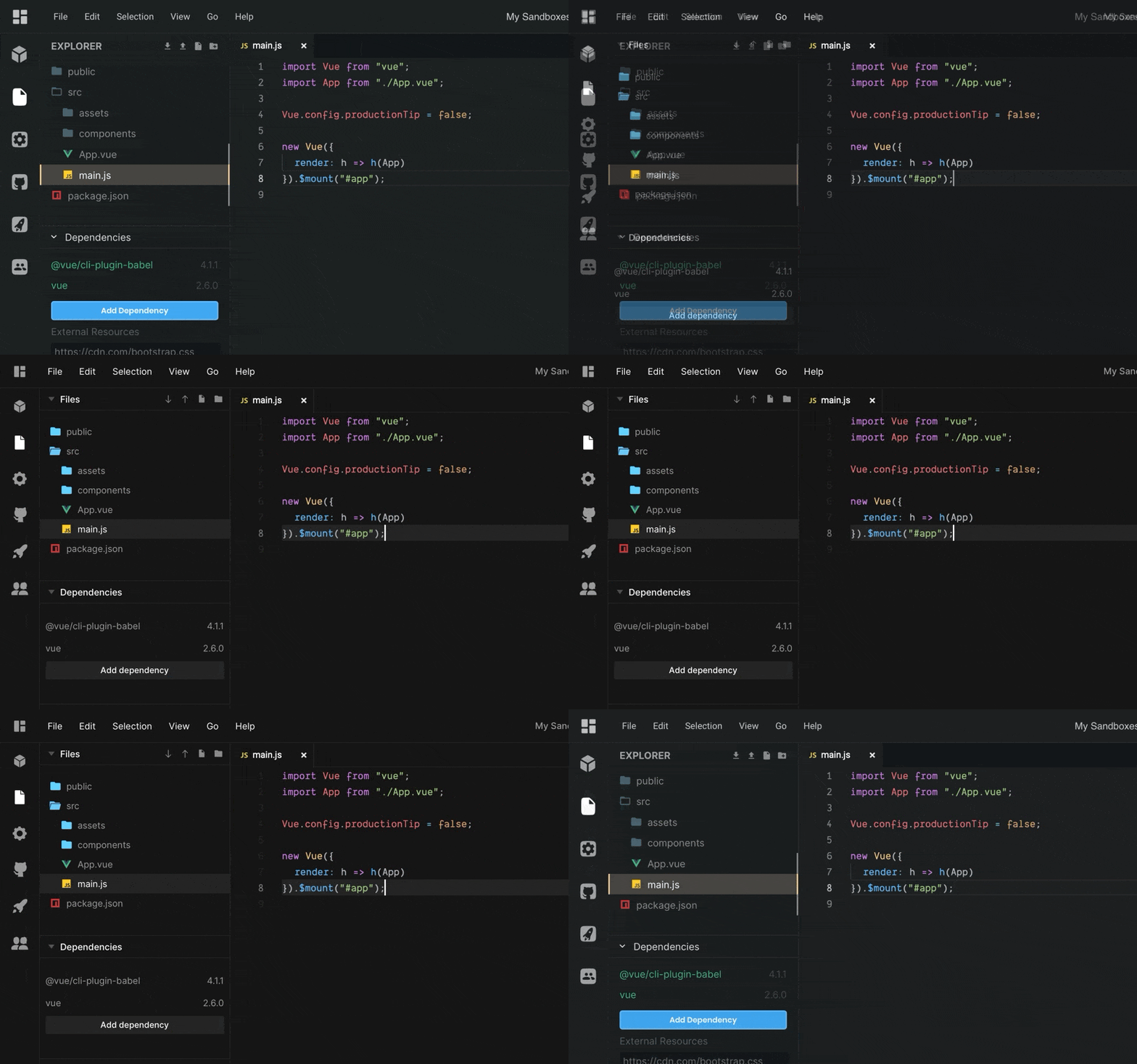
But we haven’t just been tackling the technical challenges; we’ve also refreshed the design of the editor too. This isn’t some big redesign with changes for change’s sake. We’ve evolved the look of the editor, so it retains its familiar feel but gets you to the code faster, and then gets out of your way. To make this happen, we re-worked the sidebar and top navigation with subtler styling, clearer icons, refinements to the color palette, as well as a new default theme.
Head of Design at CodeSandbox, Danny Ruchtie, adds that “although this is a significant visual refresh, it’s primarily meant to lay the groundwork for future improvements. The newly designed components system will make it easier for the team to implement new features, and it adds better support for VS Code themes too.”
There’s still work to do, both in terms of editor design and performance. For now, we’ve been running these changes as an experiment over the last few weeks, incorporating feedback from the community. It’s available for everyone to use from today, so go ahead and try it out for yourself.
Thanks
Thanks go to Sara Viera, Siddharth Kshetrapal, Christian Alfoni, and Danny Ruchtie, whose hard work made this possible. And also to those of you who have provided considered feedback while in preview. We’re excited to see what you build next!


